Friday 30 September 2016

Toolkit: Animation and Character - Timing and Spacing

Coin Excercise
The first exercise was to create an image of a 'coin' that moved from the left of the screen to the right. The first on (the top) was created with evenly spaced circles making it so the circle moved at one speed across the screen. The second (lower circle) was created by bunching the circles up at the start and end of the line, this made it slow down at the beginning and end while still reaching it's destination at the same time as the first. This is because while the spacing had changed the timing had not.

Pendulum 1 - The wrong way to do it
Pendulum 2 - Even Spacing


Pendulum 3 - Slow Start and End
The next exercise was to create 3 pendulums. The first is an example of an incorrect pendulum. This was done to show the wrong way of doing it so that there was a better understanding of why it was wrong. The first pendulum is incorrect as it does not move the way a pendulum should, instead moving on a line from side to side without dipping in the middle. The second pendulum was to show the correct shape the pendulum should make. It is made with even spacing and so moves at an even speed across the page. The third is done while bunching the circles at the start and end to create a slower effect making it look more realistic.

Sunday 25 September 2016

Toolkit: Animation and Character - Morphing a face

Morphing a face from Alexis on Vimeo.


Thumbnails - Octavia - 50 to 58


Thumbnails - Ersilia - 41 to 49


Thumbnails 13 - 40

13 - 25

26 - 40

I will be replacing these with scanned images.

The Cabinet of Dr.Caligari - Film Review

The 1920 German horror film Das Cabinet des Dr.Caligari (The Cabinet of Dr.Caligari) written by Carl Mayer and Hans Janowitz and directed by Robert Weine is an influential film that has shaped the way the horror industry works. The film follows the story of Francis and his fiancée Jane's experiences in their hometown. A strange doctor shows an exhibit of a somnambulist, Cesare, in the towns annual fair and soon after mysterious murders begin to occur.

Fig.1

The set design within the film follows the story and allows an eerie look into the characters minds. This is done through the use of distortion on the landscape, making the buildings seem crooked and out of place, with too small corridors and jagged lines. The use of distortion follows the plot in that there are scenes with more distortion and scenes with less. This could be interpreted to show the levels of sanity within the scene, for example the scenes where Cesare carries Jane across the rooftops (fig. 1) uses a lot of zigzagged lines and sharp turns contrasts with some of the more rounded scenes such as the room Jane sits in when she's brought back to her home (fig. 2). This design follows through to the fonts used as they are sharp and jagged as well as hard to read which can indicate a lack of sanity and a sinister feel.
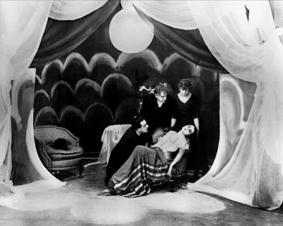
Fig.2

The characters can be felt in the rooms they inhabit, an example being Jane's room as it had a softer feel to it, showing the softness of her character in contrast to the environment she lives in. Francis' room is also a demonstration of this as it features sharp edges and appears slightly more cluttered, which can indicate the shattered nature of his psyche as well as the way he unravels through the film, while the small and crooked house Dr.Caligari resides in is bare and empty save for a chair and Cesare's box.

Images:

Fig. 1 - http://www.leninimports.com/cabinet_of_dr_caligari_poster_shop_new_2.jpg

Fig.3 - http://strosechronicle.com/wordpress/wp-content/uploads/2011/11/The-Cabinet-of-Dr-Caligari-Still-2.jpg

Tuesday 20 September 2016

Photoshop Exercises - Thumbnails 1-12

During the first Photoshop tutorial I used different methods to create thumbnails. These included some methods I had not used before and they were very interesting to try out. The first thing was to sketch the thumbnails as just line-art. I found this the easiest as I have used a graphics tablet before however as this was the first time using Photoshop I found it tricky finding a brush I liked.

Line-Art Thumbnails.
The next exercise was to sketch the thumbnails using the lasso tool to section off area's before filling them to make the image I wanted. I liked the control this gave me over what I was doing.

Lasso tool Thumbnails.
The final exercise was to use a mixture of sectioning areas with the lasso tool and using a brush to blend the shades in them.

Blending Thumbnails.

Photoshop Exercises - Still Life

There were two exercises to this, the first was a black and white study and the second was a colour study.

Original Image on the left, My re-draw on the right.

Original Image on the left, My re-draw on the right.
I found both of these very interesting as they allowed me to use brushes I hadn't before. This was my first time using Photoshop and I think they turned out looking pretty good!